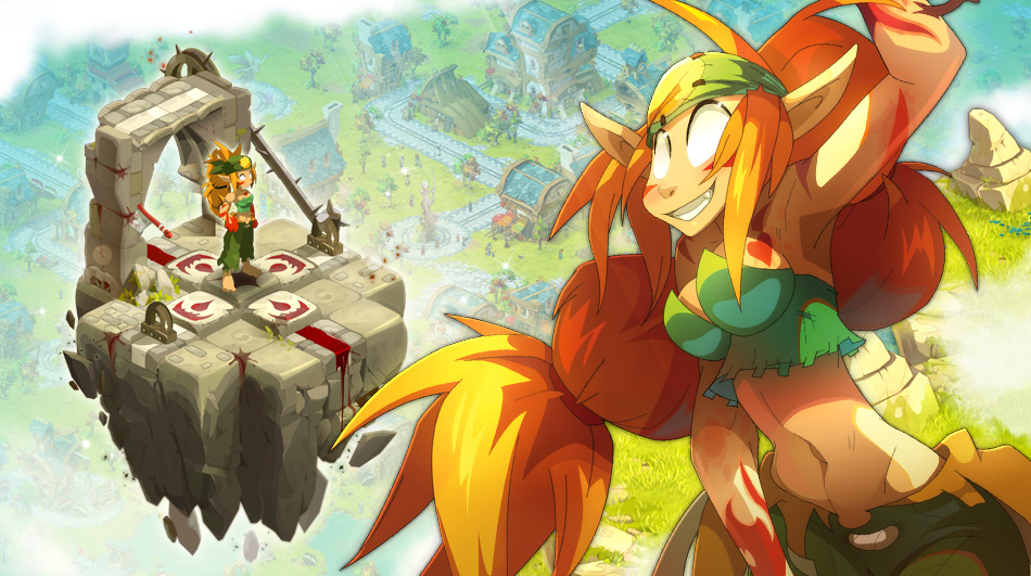
Meet the new character creation screen. ![]()
I'm dTb, and I'm a big fan of turn-based video games and board games. I've been programming since my earliest childhood. I've been on the DOFUS Touch team for over a year and have mainly worked on implementing spells, as well as on the character creation screen.
Many of you have asked us for more information about the development of DOFUS Touch, so it's with great pleasure that we're unveiling this dedicated blog. It may not be visible from the outside, but our the project team is working relentlessly to improve it – feedback from beta testers has been especially useful to accomplish this task.
Day after day, the final bugs are falling under the attack of our tireless programmers, performance is improving, and new functions are being implemented.
Today, we are going to present the character creation screen to you, which up to now has been quite spartan:
![]()
It's functional, greatly inspired by its PC counterpart, but we want to improve and adapt it even further for touch support. So here's a preview of what it will soon look like:
![]()
![]()
You will have immediately noticed that its graphical aspect has been greatly improved, but that's not all:
We hope that you will enjoy this new interface.
Looking at these first images, what do you think?

Hello all,
I'm dTb, and I'm a big fan of turn-based video games and board games. I've been programming since my earliest childhood. I've been on the DOFUS Touch team for over a year and have mainly worked on implementing spells, as well as on the character creation screen.
Many of you have asked us for more information about the development of DOFUS Touch, so it's with great pleasure that we're unveiling this dedicated blog. It may not be visible from the outside, but our the project team is working relentlessly to improve it – feedback from beta testers has been especially useful to accomplish this task.
Day after day, the final bugs are falling under the attack of our tireless programmers, performance is improving, and new functions are being implemented.
Today, we are going to present the character creation screen to you, which up to now has been quite spartan:

It's functional, greatly inspired by its PC counterpart, but we want to improve and adapt it even further for touch support. So here's a preview of what it will soon look like:


You will have immediately noticed that its graphical aspect has been greatly improved, but that's not all:
- The choice of class and other graphical customizations are now divided between two separate screens, which will lighten this step (so important in a character's life) and make it much more pleasant.
- The text and button size has been increased to be easier to read.
- The size of the color picker has also been increased. It now uses a new algorithm, immunizing it against "big finger" problems, all the while making it more accurate.
- Color slots are now pre-filled with the character's default color, to more quickly identify which slot corresponds to which part of the body. No need to press all the buttons to find the skin color any more!
We hope that you will enjoy this new interface.
Looking at these first images, what do you think?